How New Blockchain Apps Make It Easier To Use DeFi
June 25, 2021

This is the final installment of the six-part Welcome to Crypto series, which covers everything from the advantages of digital assets and how to buy crypto to how to read cryptocurrency price charts, and why they matter.
Catch up:
Part 1: The Benefits of Cryptocurrency and Blockchain Technology
Part 2: How Does Cryptocurrency Have Value, and Why Should I Care?
Part 3: The Different Types of Cryptocurrency Tokens Explained
Part 4: A Guide to Crypto Wallet Types
Introduction
To get comfortable using and holding crypto assets, a basic understanding of their market dynamics and behavior is necessary. That might sound daunting to those new to the crypto space, but demystifying the price movements of leading crypto assets, including MakerDAO’s decentralized stablecoin, Dai, is not nearly as challenging as you might believe. In fact, the key to understanding cryptocurrency price charts is familiarization with the basics of traditional investment, from simple terminology and rudimental theory to bringing context to bear and formulating strategies.
To Read Crypto Price Charts, First Understand Key Terminology
Even the most successful investors began their journeys with an understanding of basic yet essential words and concepts. Here are a few key terms to help you understand cryptocurrency price charts as a new enthusiast.
Meet Charles H. Dow and the Theory Named After Him
Since you’re interested in crypto assets, you’re likely familiar with the leading stock market index—the Dow Jones Industrial Average, most often called simply “the Dow.” But you might not know that it is named after Charles H. Dow, co-founder of Dow Jones & Company and the first editor of The Wall Street Journal.
Mr. Dow is also known for an important theory—the eponymous Dow theory, which was derived from his editorials and has served as the foundation of modern data-driven trading strategies for decades. The theory has six basic tenets that together provide a great jumping-off point for understanding the price fluctuations and behavior of crypto assets.
The 6 Tenets of the Dow Theory
1. The market has three types of movements:
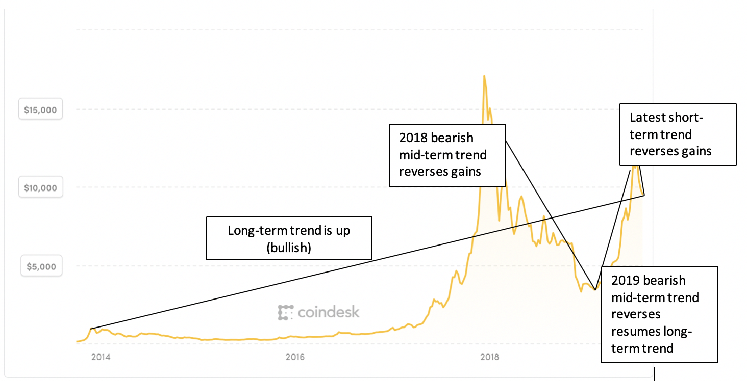
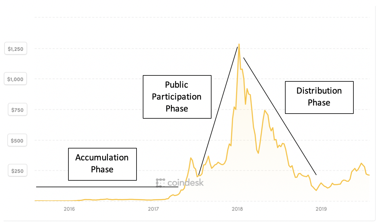
2. Market trends have three phases:
3. Stock prices quickly incorporate new information. Therefore, current listed prices reflect all available information about a given asset.
4. Stock market averages must confirm each other. This refers to the expectation that the stocks of companies in complementary industries move in similar directions. For example, if the global demand for oil increases, raising the price of energy company stocks, one would expect to see a similar increase in tanker industry stock prices.
5. Trends are confirmed by volume. Confirmation is easier when price movements upward or downward are correlated with a high number of trades of various levels of value. In crypto markets, it’s possible for a single trade to impact the price of a given asset by a double-digit percentage over a short period of time. Therefore, it is important to thoroughly investigate a price movement to determine if a trend is reversing.
6. Trends exist until definitive signals prove they have ended. This suggests that investors should look past intermittent fluctuations in the market and refrain from making broad statements regarding the status of the market without definitive proof or substantive technical analysis.
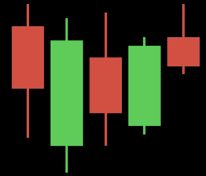
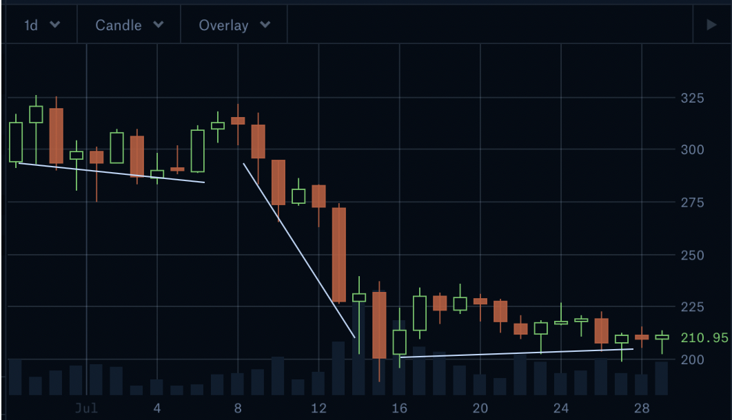
Candlestick Charts Shine a Light on Understanding Crypto Price Charts
To implement trading strategies, investors utilize the information above while turning to candlestick charts that succinctly provide a great deal of actionable information. These charts, which originated in Japan, are clearly identified by the unique “candles” that are plotted along the axes.
Each candle is either green or red, signaling whether the price increased or decreased, respectively, over a given time period. The candles are plotted on a typical chart, with the top and bottom of each aligning with the opening and closing price of the asset. Notice, too, the narrow vertical lines protruding from the ends of each candle. These lines are called “shadows” and the end of each one represents the high and low for the asset, respectively, over this abbreviated time period.
When It Comes to Price Charts, Context is Everything
In 1954, journalist Darrell Huff wrote a book titled, How to Lie with Statistics. He walks the reader through a series of common fallacies with statistics that can distort one’s perception of a given number set or sample. Primary among them is “correlation does not imply causation.” Additionally, he demonstrates that by manipulating the range and axes of a chart, a graph can actually be used to distort reality.
Keeping that in mind, it’s important to take a Goldilocks approach as you read crypto price charts: Seek a time horizon that not only shows recent trends, but also provides just enough of a vantage point to put it into a big picture.
Let’s take a look at how this appears in practice.
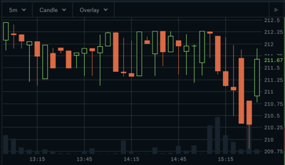
Figure 3 below is a candlestick chart illustrating the Ether-Dai (ETH-DAI) price over a 2.5-hour period. Each candlestick reflects the price movement for a distinct 5-minute period throughout the time frame. You will notice that the opening price was 212.08 Dai, and the period closed down at 211.37. Additionally, over this brief period, there is a relatively even distribution of red and green candlesticks, as well as large and small shadows. This indicates a lack of a clear trend regarding this market.
Zooming Out
Figure 4 below illustrates a one-month period, with each candlestick representing the net trading results for a single day. Within this period, there was a downward trend in the ETH-DAI price that reached its nadir around 200.00. Since then, it has traded within a relatively narrow band and intra-day fluctuations have dampened.
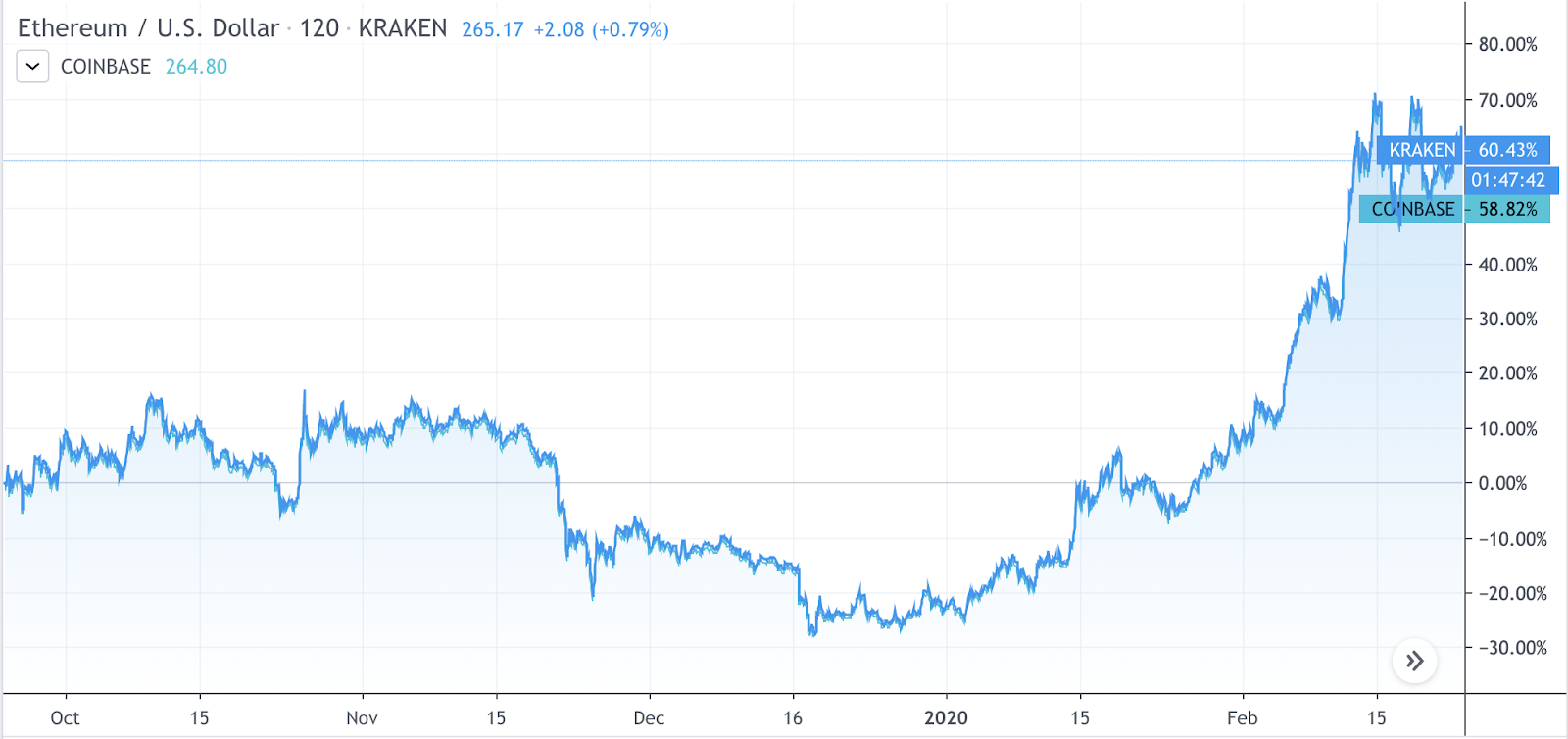
However, even this is not the total picture. When we refer back to the Ether price chart (Figure 2), we see an overall upward trend.
Understanding Dai Price Charts
Because Dai is a stablecoin soft-pegged to the US Dollar, long-term trends in its price are extremely unlikely. While one may see minor fluctuations, they have generally remained within a very narrow band.
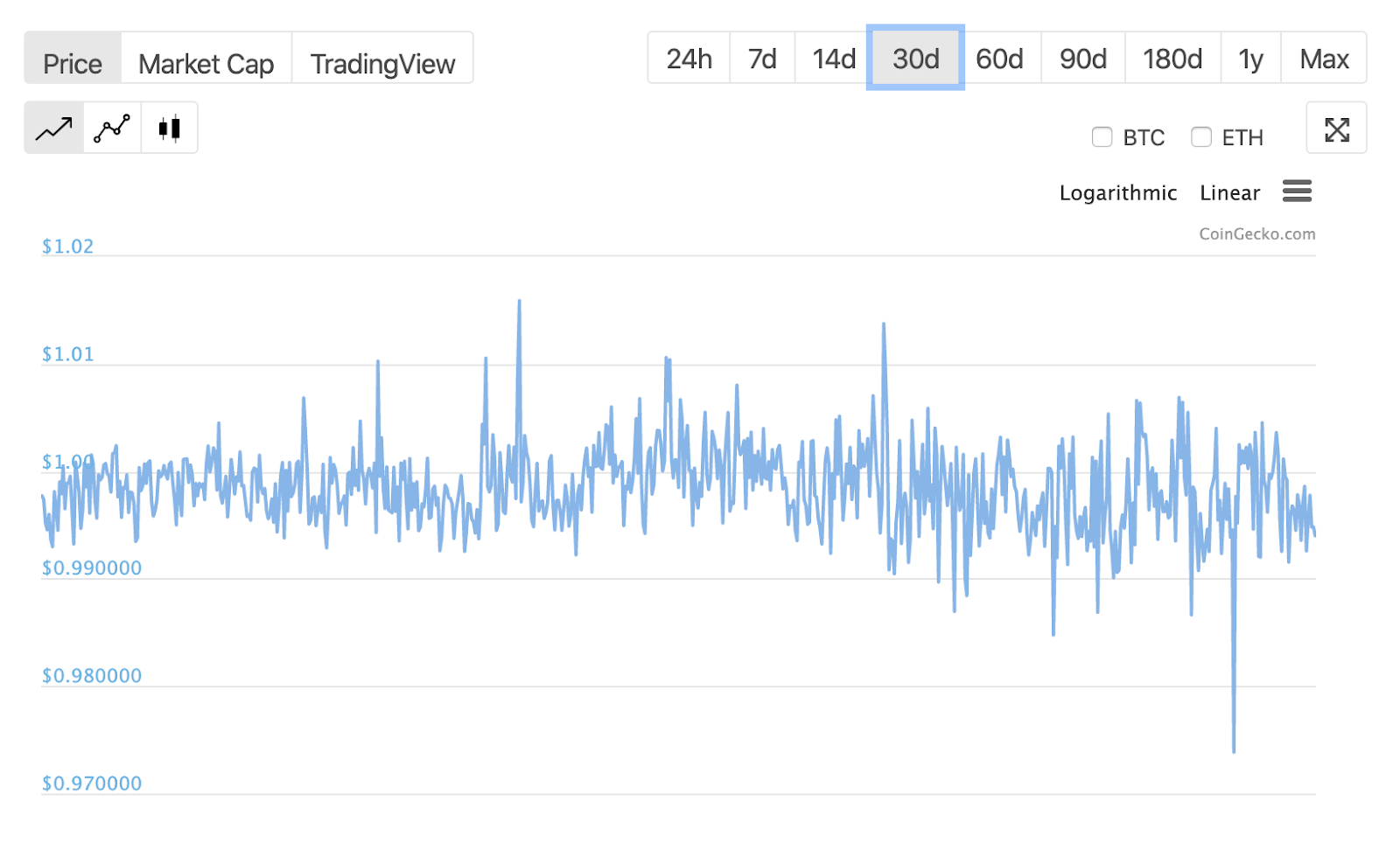
Figure 5 below illustrates Dai’s price performance over one month (January 22-February 21, 2020). During that time, Dai reached a high of nearly $1.02 and a low of not quite $.97. There are a number of shorter-term movements above and below the $1.00 target, but the 30-day trend demonstrates that Dai is functioning as intended, overall.
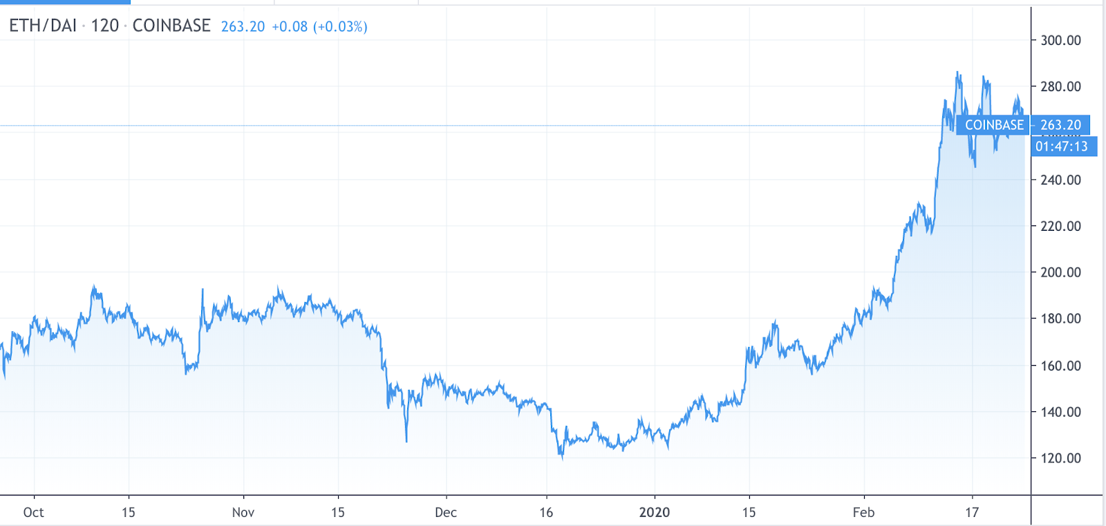
So, the best way to think about Dai when it comes to price charts is to consider it to be analogous to the US Dollar as part of a trading pair. Take a look at the trading view comparison below for ETH/DAI and ETH/USD since October. You can see they are identical.
Cryptocurrency Price Charts: Next Steps
With this foundational material under your cap, you can begin to track the performance of Dai and other assets over time to see how they react to news and other market stimuli. As you get more comfortable and increase your knowledge, you can more deeply analyze market sentiment and trends.
The MakerDAO community consists of people from all over the globe. If you are interested in learning more about Dai and the Maker Protocol, explore the conversations in our chat and on the Maker Forum.
DISCLAIMER
This content is provided for informational purposes only, and should not be relied upon as legal, business, investment, or tax advice. You should consult your own advisers as to those matters. Charts, graphs and references to any digital assets are for informational and illustrative purposes only.
Charts and graphs provided within are for informational purposes solely and should not be relied upon when making any purchase decision. The content speaks only as of the date indicated.